UX Case Study
Calgary 311 App
I led a mobile-first redesign of Calgary’s 311 reporting app to reduce reporting friction and increase the number of successful service requests by 50%. Using user interviews, task-based usability testing, and iterative prototyping, I simplified reporting flows, clarified outcomes, and improved accessibility.

My Role
UX Researcher & Interaction Designer
Duration
4 months | 2025
Tools
Figma, FigJam, Illustrator, InDesign
Link

Overview
Calgary’s 311 app fell short of what residents needed. With 80+ unclear categories, people struggled to find the right option, felt uncertain about what would happen next, and often abandoned reports altogether. The city needed a clearer, more accessible mobile experience to guide users from issue to outcome.
/Goal
Redesign the 311 app so residents of all tech literacy levels can report issues in under 3 minutes, confidently choose the right category, and feel certain their request was received.
I restructured 80+ services into 10 intuitive categories, designed a clear four-step reporting flow, and added real-time confirmation at every stage.
/Result
The redesign yielded a clear and measurable improvement in usability and user confidence. Through iterative testing and refinement, users were able to complete service requests faster, with fewer errors, less frustration, and reduced task abandonment.
Beyond the numbers, the most meaningful change came from how users felt. Participants described the new design as simple, clear, and trustworthy.
Design Process
I Used A Human-Centred Approach to Design Thinking
I followed a human-centered design process that moved through six key phases: Discover, Define, Ideate, Design, Test, and Refine.
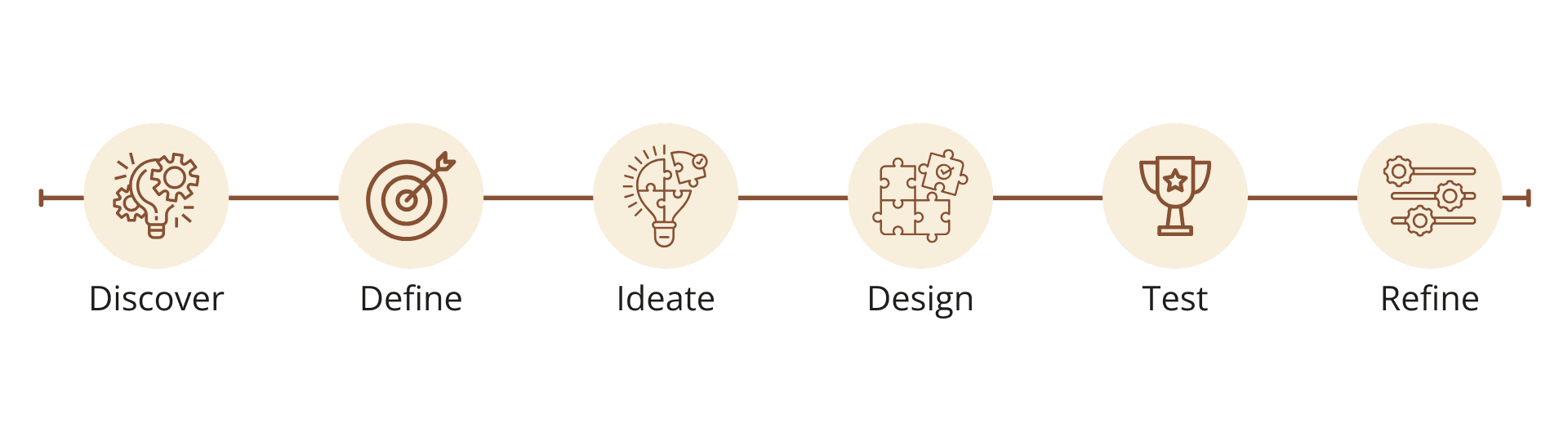
Each step was built on real user insights, guiding decisions from early research to final improvements.
Discover: Understanding Where the Current Experience Falls Short
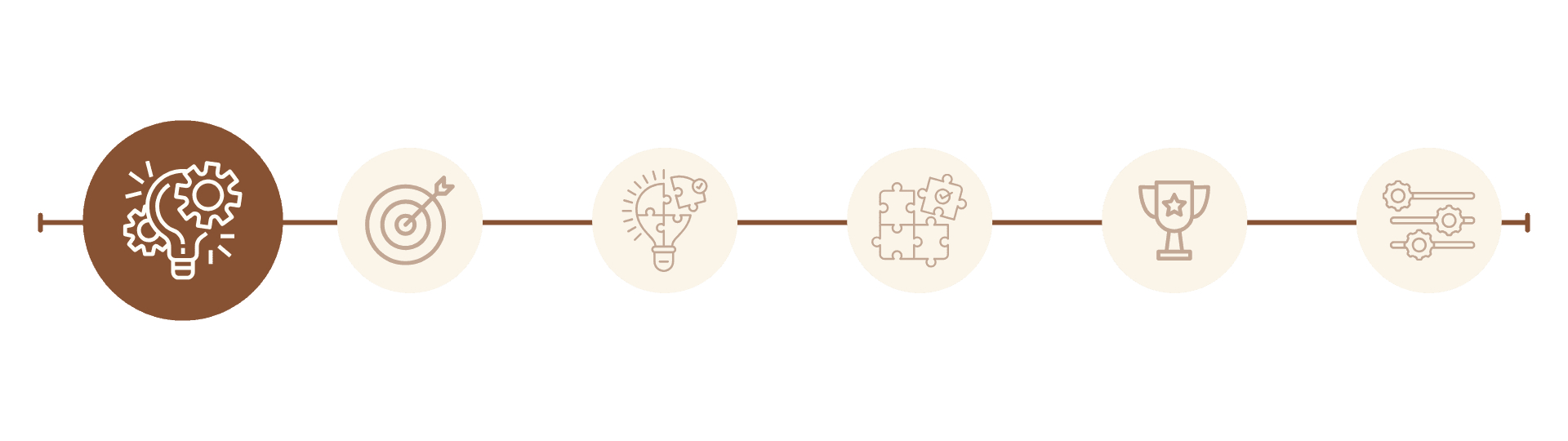
This phase focused on uncovering how residents interacted with the existing Calgary 311 app and identifying the usability barriers that caused frustration, confusion, and task abandonment.
1. Preliminary User Testing of the Existing 311 App
Observing Real User Behaviour
I observed four users as they navigated the original app, noting where confusion or hesitation occurred. These insights revealed major pain points in category naming and task completion flow.
Reviewing Test Sessions and Feedback
The visuals show screen recordings of participants using the original Calgary 311 app during think-aloud usability testing. Participants provided real-time feedback, offering insight into where the experience broke down.
Key Insights from User Testing
Users took an average of seven minutes to complete a service request, while half were unable to finish, and all four reported feeling overwhelmed or confused.
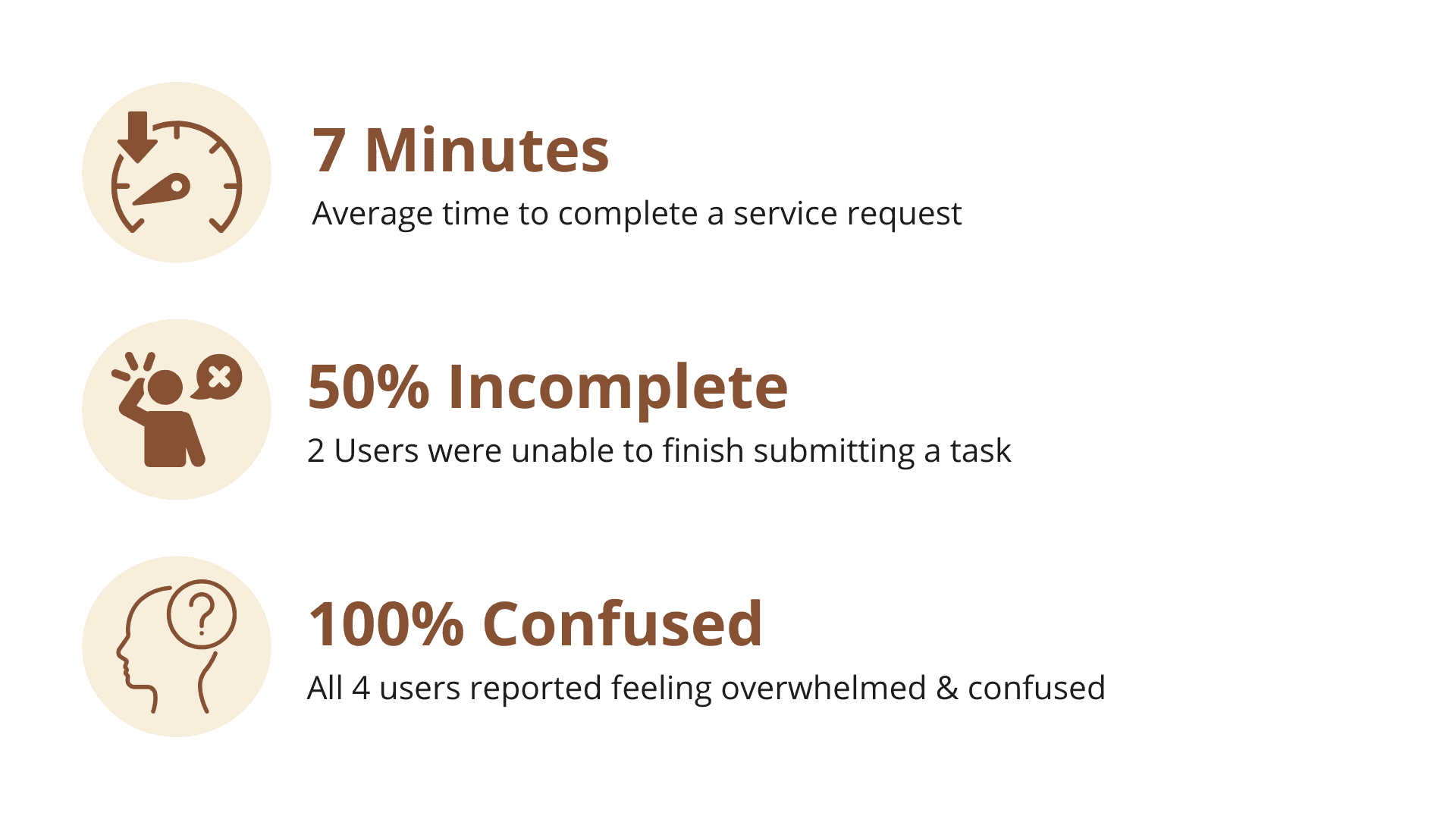
This confirmed that the app’s structure and language created friction, setting a clear direction for the redesign.
2. Validation Through Social Proof
Analyzing User Sentiment
To validate early testing insights, I reviewed user feedback from Google Play, the Apple App Store, and Reddit to understand how residents described their experience.
Reviewing App Store and Public Feedback
Below are highlighted direct quotes and ratings from the Google Play Store, Apple App Store, and Reddit. Across all sources, residents consistently reported frustration with the Calgary 311 app's confusing navigation and unclear request tracking, resulting in a lack of trust in the system’s reliability.
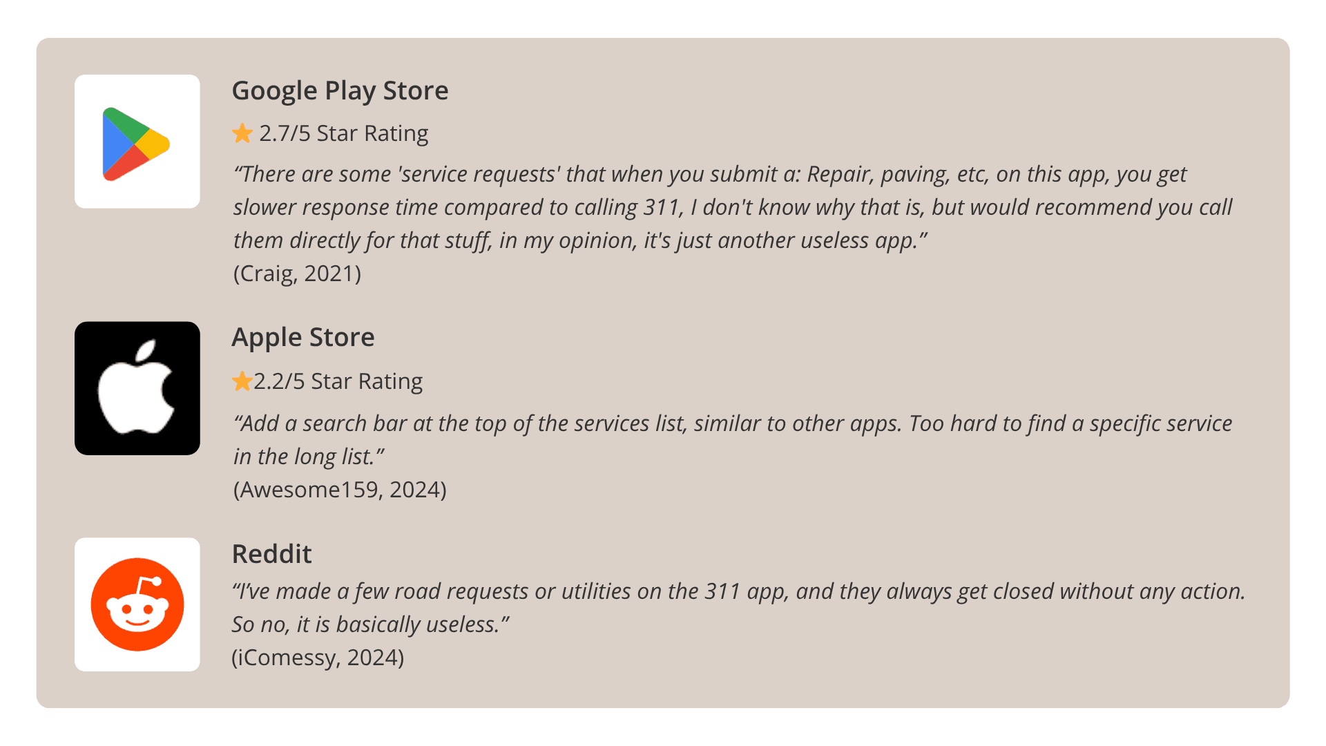
Key Insights from Social Proof
Ratings on Google Play (2.7 stars) and the Apple App Store (2.2 stars) signaled ongoing usability challenges, while Reddit discussions revealed deeper concerns about transparency and follow-up.
This external validation reinforced user testing findings and confirmed that the experience fell short of user expectations, thus eroding trust.
3. Industry Benchmarking
Establishing a Comparative Baseline
I conducted a UX audit of municipal service apps from Vancouver, Toronto, and Ottawa to identify opportunities for improvement.
The visuals show each city's homescreen app with notes outlining what they do well and where Calgary could improve. Toronto showed clear service categories, Vancouver offered integrated search and tracking, and Ottawa demonstrated strong transparency and notifications.
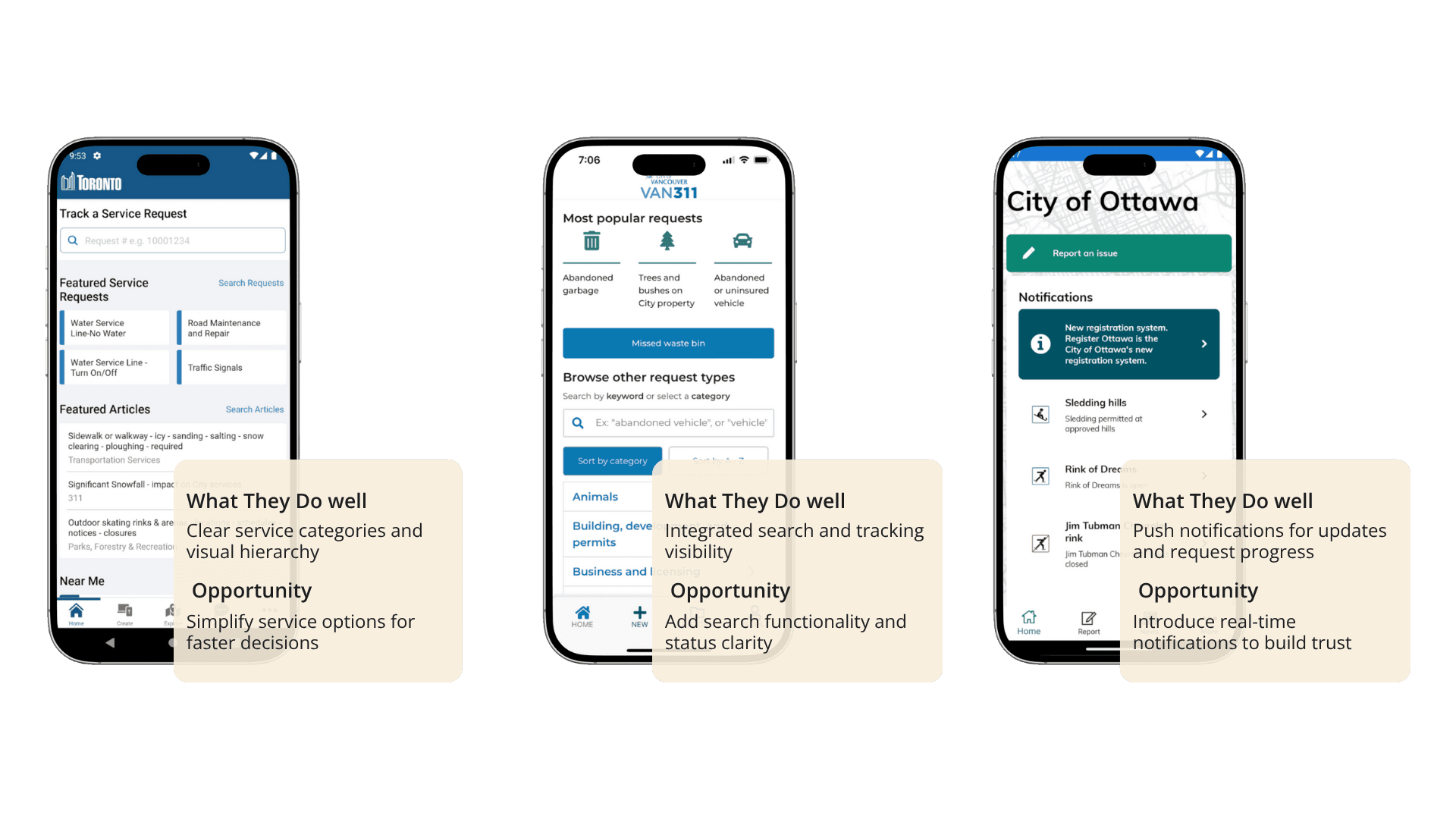
Key Insights from Benchmarking
These apps showed proven design strategies and accessibility patterns that improved clarity and user confidence. This helped define opportunities for a more intuitive and trusted Calgary 311 experience.
Define: Converting User Pain Points into Clear Design Requirements
This phase translated research findings into an understanding of who the users are, what they need, and how the experience should support them.
1. User Persona Development
Understanding the User
The persona was developed using insights from early user testing and interviews to represent the primary demographic most affected by the app’s usability challenges.
Persona Overview
Linda Shore is a 63-year-old retired school administrator from southwest Calgary. Linda is civic-minded and wants to contribute to her community, but she often feels overwhelmed by excessive service categories and unclear labels within the app.
Her goals are simple; she wants to spend less time choosing the right category, submit a request confidently, and trust that her report is being reviewed.
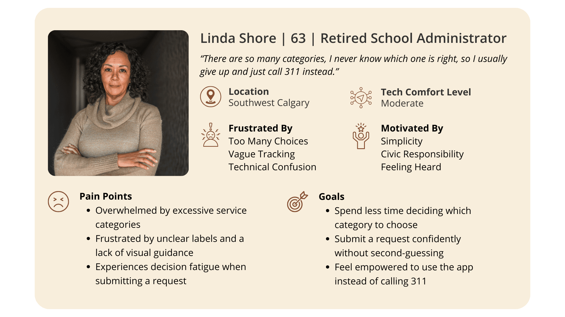
Linda’s experience served as a guiding anchor throughout the project, helping shape decisions focused on clarity, accessibility, and user confidence.
2. Tasks, Actions & Behaviours (TAB) Analysis
Mapping Pain Points to Opportunities
The TAB analysis visualizes how users currently interact with the app, outlining their key tasks, the actions they take, and where breakdowns occur. It also highlights desired behavioral shifts that would result from improved usability.
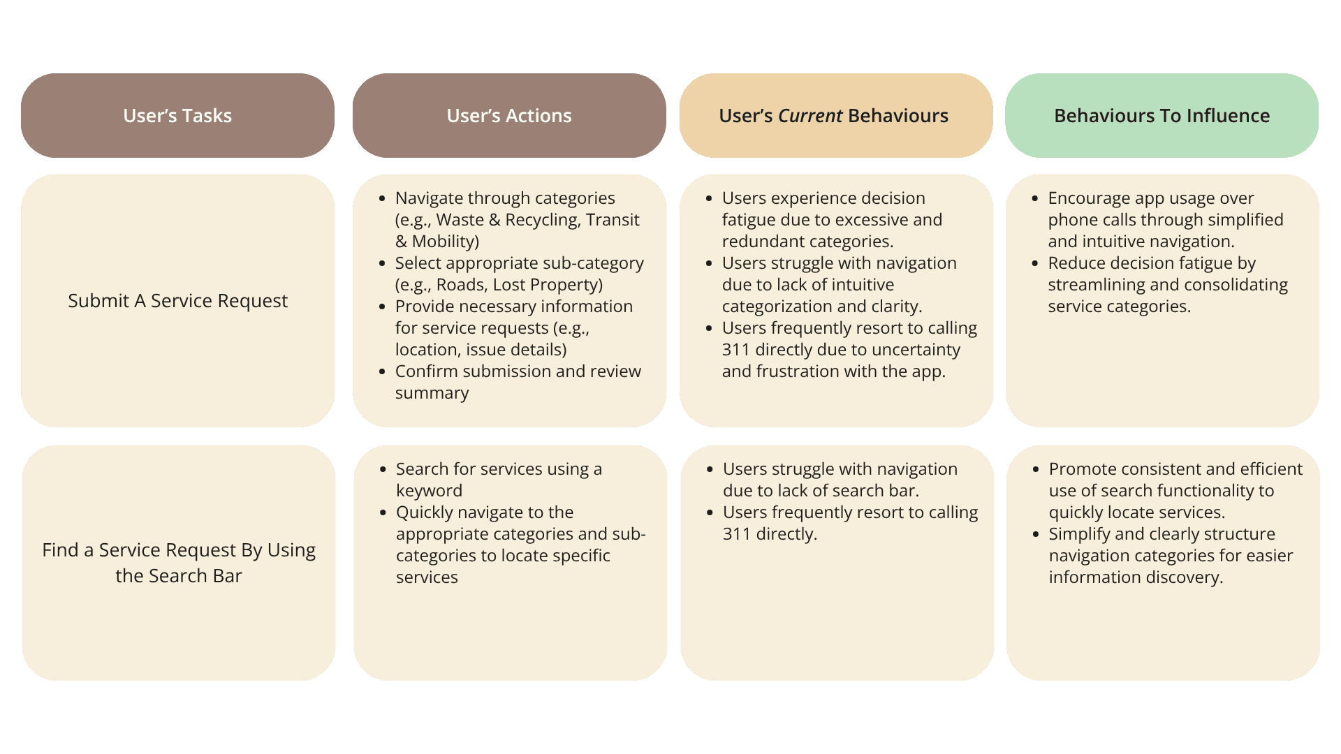
Key Insights from TAB Analysis
The analysis revealed that users often experience decision fatigue during category selection and confusion when tracking requests, which leads to frustration and task abandonment.
By simplifying categories, clarifying language, and improving feedback through progress indicators, the redesigned experience aimed to reduce stress, encourage successful task completion, and rebuild trust in the system.
3. User Journey Comparison Between Current & Proposed Experiences
Purpose of the Journey Map
This visualization compares the original Calgary 311 user experience with the redesigned version, showing how the new structure improves clarity, flow, and overall user confidence. It highlights key emotional shifts at each stage of the journey and how targeted design decisions transformed frustration into trust.
Understanding the User Experience
The journey map outlines five key stages, from opening the app to submitting a request. In the current experience, users frequently felt confused, overwhelmed, and uncertain. Pain points such as unclear navigation, excessive service options, and a lack of confirmation after submitting a request contributed to a 35% negative overall experience.
In contrast, the proposed experience replaces confusion with structure, guidance, and reassurance. Simplified categories, improved search functionality, and clear progress indicators help users stay oriented and confident as they move through the process. Confirmation screens and transparent status tracking further reduce uncertainty, resulting in an 85% positive overall experience.
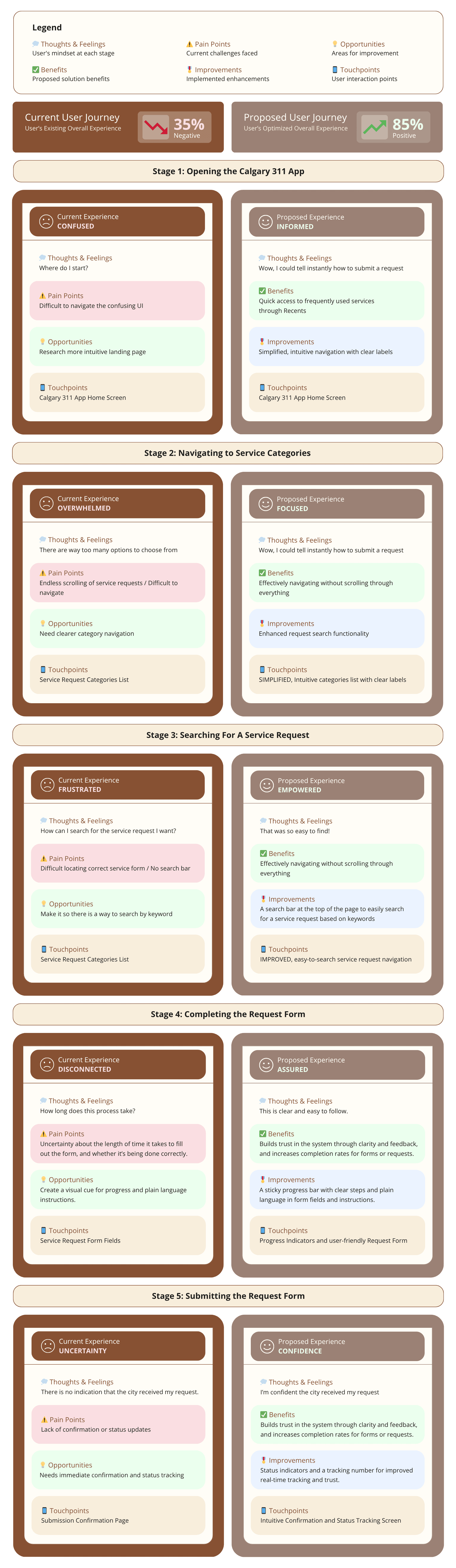
Measured Impact
The comparative journey map and data visualization demonstrate a projected 50% improvement in overall user experience.
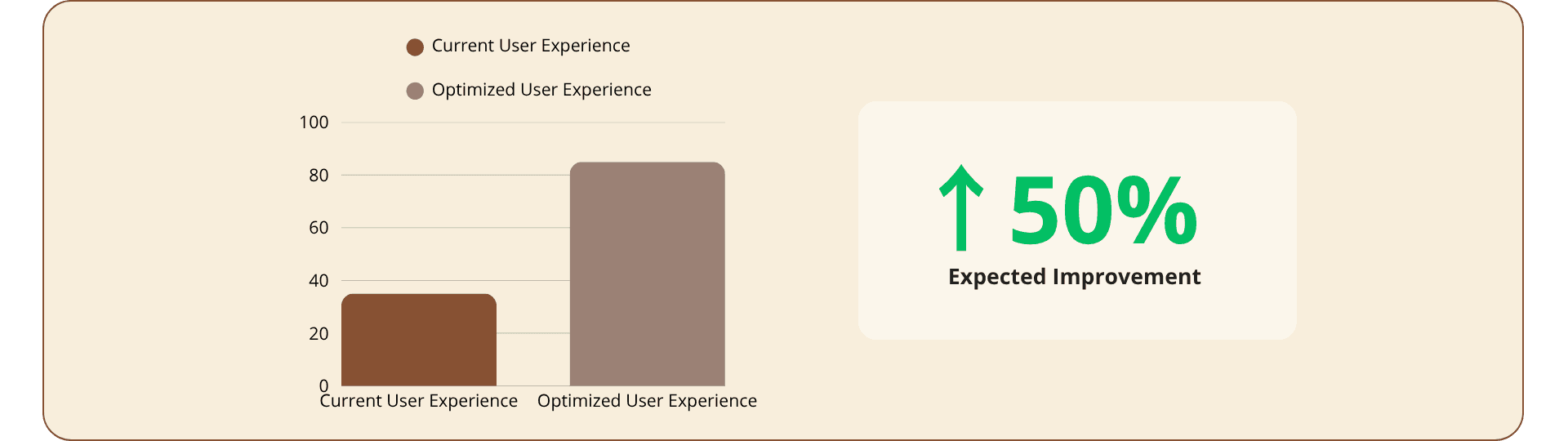
This measurable shift highlights how thoughtful UX decisions can transform the experience from confused and disconnected to informed, supported, and confident.
4. Defining The Problem
What We Know
The Calgary 311 app makes it difficult for users to complete a service request due to poor category structure and unclear language. These usability barriers create confusion and slow down task completion, especially for users with lower digital confidence.
Key Challenges Identified
The visuals highlight the primary pain points uncovered during early user testing. As shown in the screen recording, the long, overlapping list of service categories created decision fatigue, cognitive overload, and frequent misinterpretation of labels. Users often hesitated, scrolled repeatedly, or chose the wrong category altogether.
Summary of Insights
A more intuitive categorization system was needed to reduce confusion and help residents quickly find the right service. Simplifying navigation and clarifying language became key design priorities and ultimately formed the foundation for the updated information architecture.
Ideate: Exploring User Mental Models & Structuring Information
In this phase, I transformed research findings into design opportunities. Using card sorting, I explored how users naturally group services, creating a clearer and more intuitive category structure for the Calgary 311 app.
1. Card Sorting & Unexpected Insights
Uncovering User Logic to Create a Clearer Structure
To improve the app’s information architecture, I ran a card sorting exercise with five users exploring how they naturally grouped services. The findings helped inform a more intuitive category structure.
The visuals show the digital card-sorting boards and my observation notes. When users were initially presented with all 80+ service requests, frustration and overwhelm quickly surfaced, thus unintentionally mirroring the same issue found in the current 311 app. This confirmed the need for a more streamlined structure.
2. Synthesizing Results into Primary & Secondary Categories
Turning Complex Data into a Clear, User-Friendly Structure
After analyzing the results, I consolidated the full list of service requests into 10 primary categories and 6 subcategories. This streamlined hierarchy significantly reduced cognitive load and helped residents locate the correct service more quickly.
The visuals highlight how related services were grouped under clear, recognizable headings, creating a logical flow that supported faster decision-making and reduced user frustration.
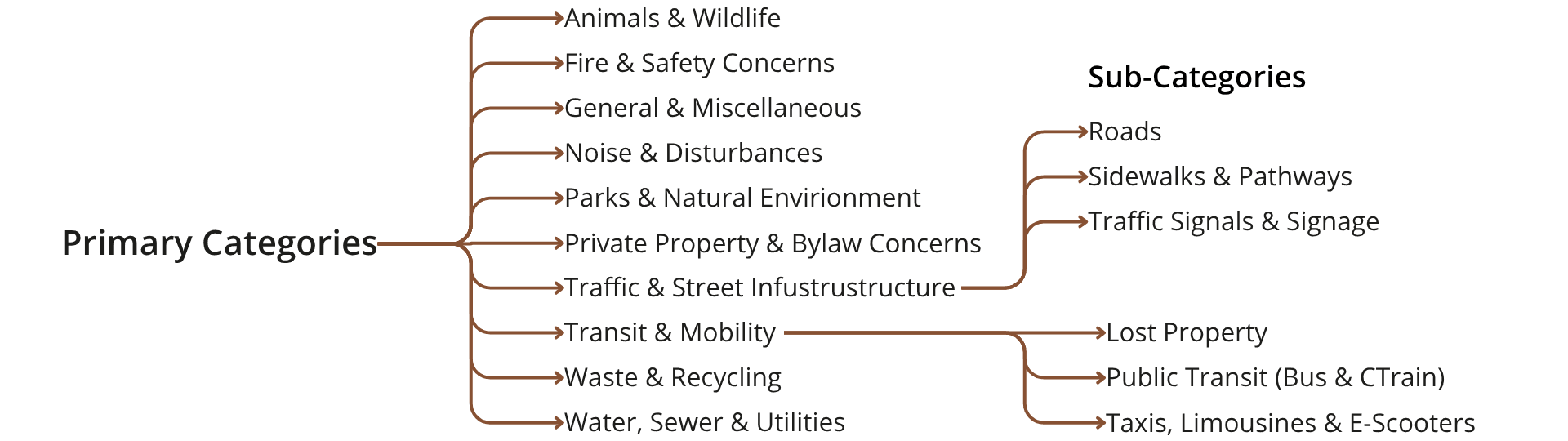
View Card Sorting Research & Synthesis →
Design: Crafting the Solution
In this stage, I translated insights and information architecture into tangible design solutions. The focus was on building clear pathways for completing and tracking service requests, ensuring the experience felt intuitive, efficient, and consistent from start to finish.
1. Mapping the Updated User Journey
Designing Efficient Flows for Clarity and Confidence
I created detailed user flows to visualize the complete process of submitting and tracking a service request within the Calgary 311 app. These flows helped define key decision points, streamline interactions, and reduce unnecessary steps that previously caused confusion or drop-offs.
User Flow Diagram
The flowchart outlines two core interactions: completing and submitting a service request, and tracking an existing one. By mapping each step, I identified where users encountered friction and optimized the sequence for clarity. This ensured every task followed a logical, predictable path, minimizing cognitive effort and building user confidence throughout the process.
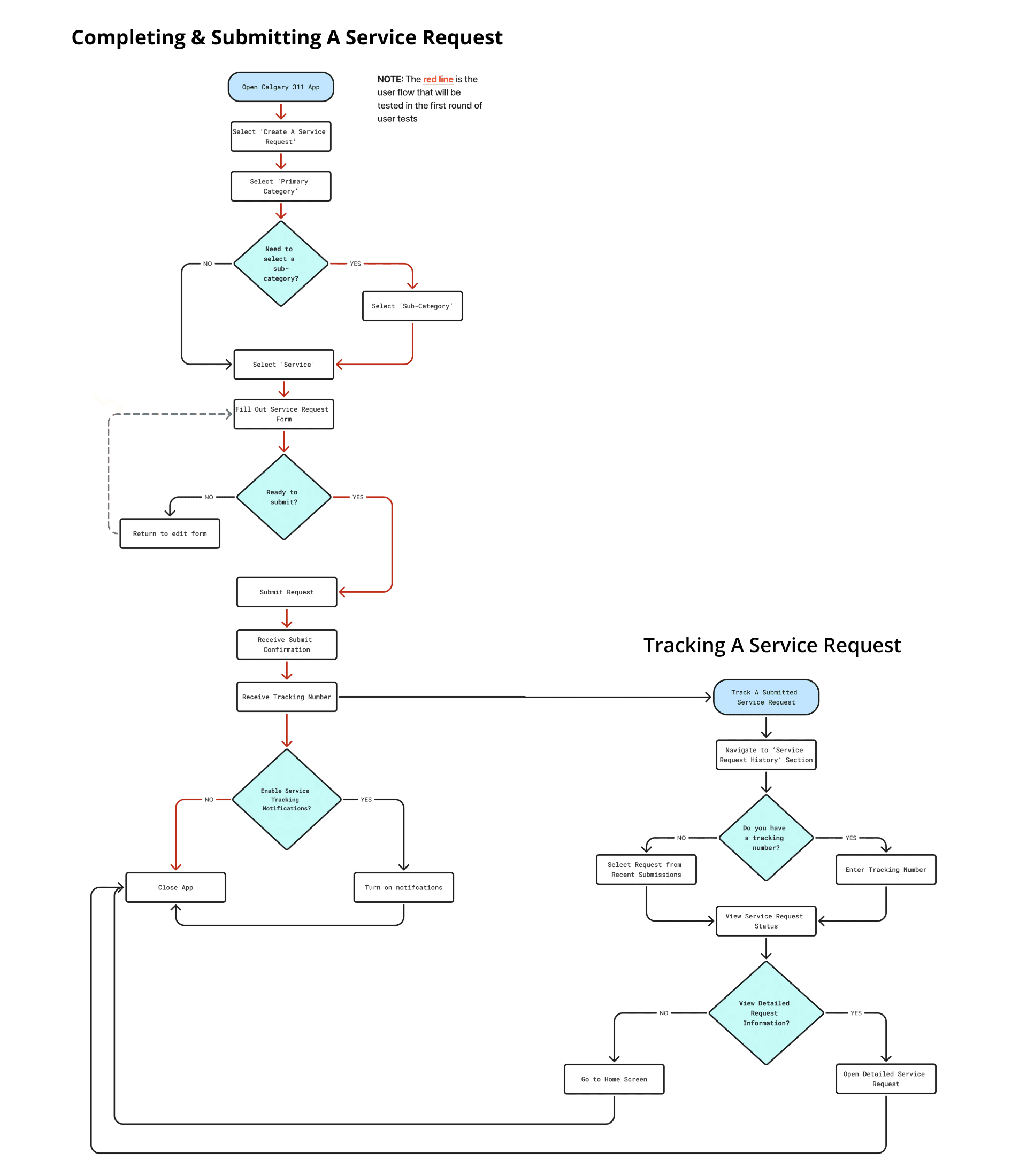
The final user flow became a blueprint for the redesign, guiding layout decisions and reinforcing an intuitive, task-focused experience.
2. Rapid Prototyping with Wireframe Sketches
Translating Ideas into Fast, Testable Layouts
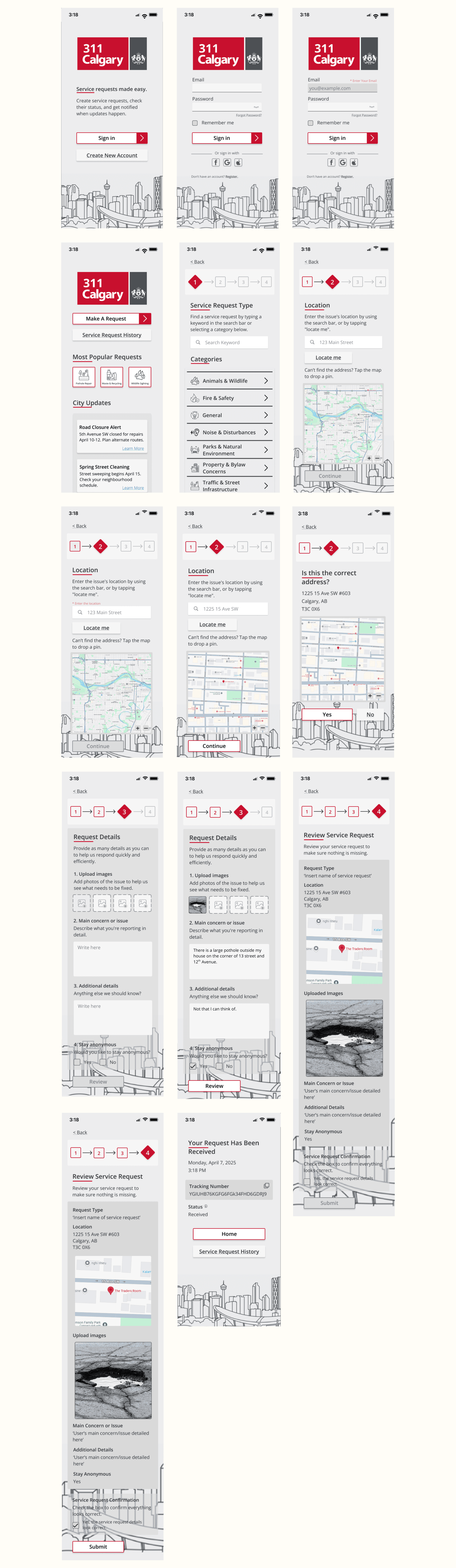
To bring the new flow to life, I produced low-fidelity wireframe sketches that mapped out how each screen would support a smoother request experience. These sketches established hierarchy, navigation patterns, and essential content placement before moving into more detailed design.
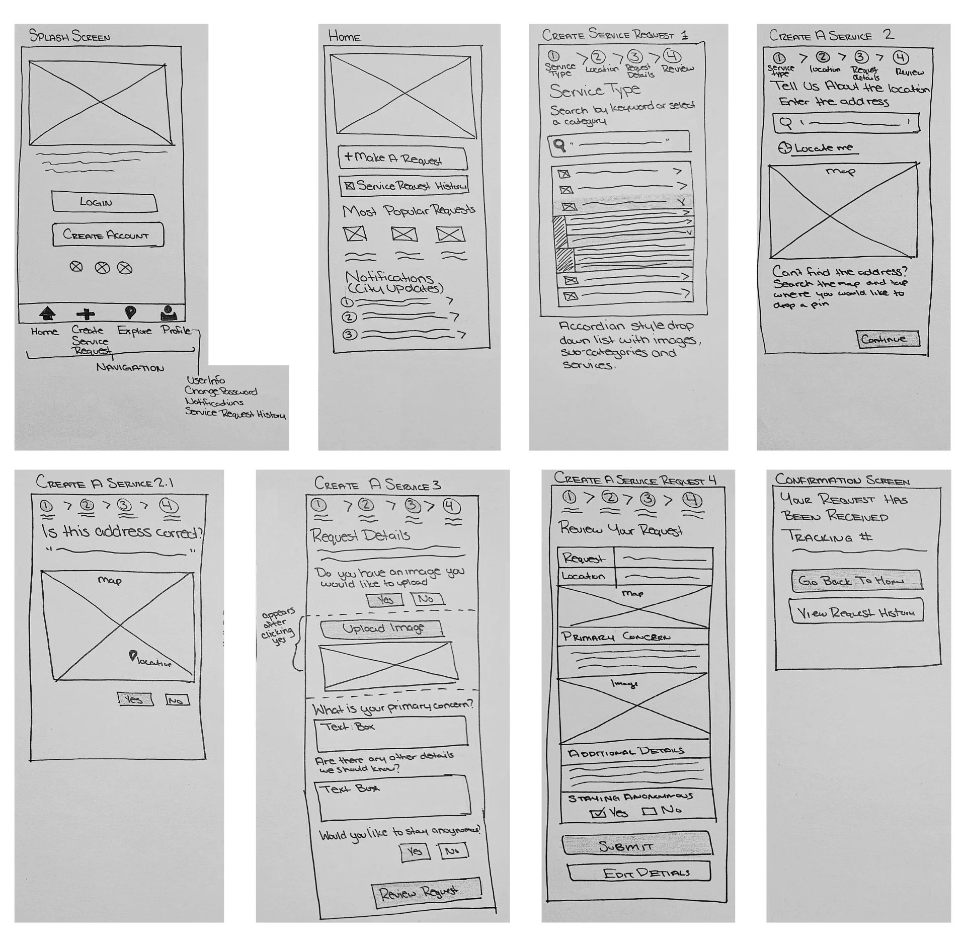
The wireframes map each step of the submission process, from launching the app to confirming a request. Rapid sketching helped me explore layouts, validate structure with peers, and refine the flow for clarity. This early exploration created a strong foundation for later prototypes.
3. Developing the Mid-Fidelity Prototype
Building Usability into Early Interaction Models
After refining flows and wireframes, I developed a mid-fidelity prototype that allowed users to interact with the redesigned experience. This version introduced interactive elements that allowed users to navigate through the full service request process, from selecting a category to submitting and reviewing a request.
The visual shows a series of mid-fidelity wireframes and a recording of the clickable prototype. This prototype included key screens and transitions that supported category selection, submission, and confirmation. It focused on validating navigation patterns, hierarchy, and flow consistency before moving into high-fidelity design.
Test: Validating the Redesign Through User Feedback
In this phase, I tested the first interactive version of the redesigned Calgary 311 app to evaluate how well the new structure improved usability and task completion. The goal was to validate navigation, language clarity, and overall user confidence.
1. Testing Version 1 Navigation with Users
Assessing Usability Through Observation and Feedback
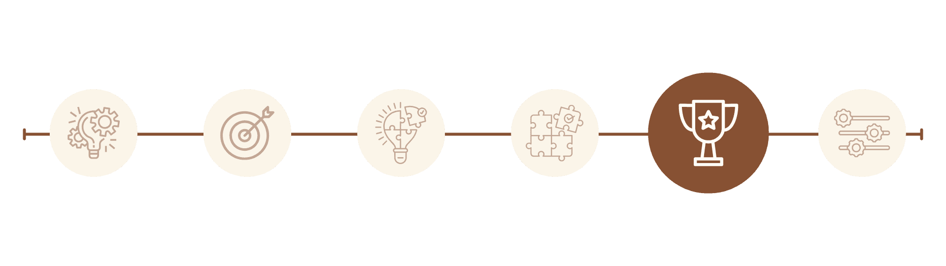
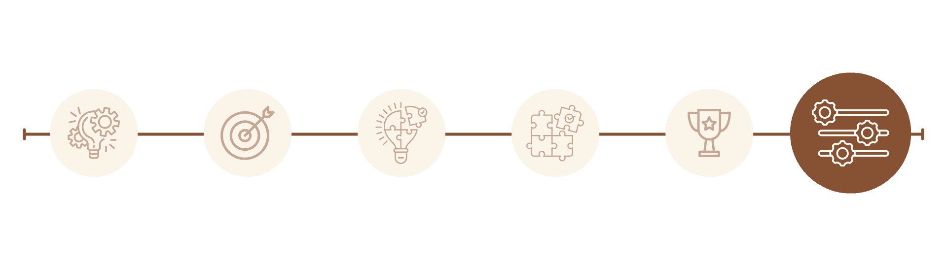
Using a mid-fidelity prototype informed by my comparison analysis and card sorting, I conducted task-oriented usability testing with three participants using the think-aloud method. As participants verbalized their thoughts while navigating the redesigned flow, their insights revealed key usability issues and areas of friction that guided improvements to the final high-fidelity prototype. The test focused on three main objectives, which are shown in the accompanying visual.
Measuring Improvements in Clarity and Effort
Testing showed clear improvements across key usability metrics. Participants completed tasks more quickly, made fewer navigation errors, and expressed stronger confidence in using the app. These results confirmed that the redesigned structure made the experience faster, clearer, and more accessible.
Conclusions from Testing
User feedback validated that the redesign successfully addressed the original issues of confusion and inefficiency. Participants consistently found the new structure easier to navigate and more reassuring. These insights guided the next phase, where I refined visual hierarchy, interaction details, and accessibility to deliver a polished final experience.
Refine: Elevating the Experience for Final Delivery
The final phase focused on creating a clear and accessible interface that prioritized simplified service categories, streamlined task flows, and a layout aligned with user expectations. Testing insights informed refinements to visual hierarchy, spacing, and interaction timing, ensuring the final solution felt intuitive, cohesive, and polished.
1. Refined Interactive Prototype
Bringing the High-Fidelity Design to Life
The refined prototype showcases the complete interaction flow, allowing users to easily navigate between categories, submit requests, and track progress. Microinteractions and transitions were fine-tuned to enhance clarity and reinforce feedback, ensuring the experience felt responsive and trustworthy.
2. High-Fidelity Wireframes
Defining the Final Structure and Flow
The high-fidelity wireframes represent the finalized layout for every stage of the service submission process. Screens were refined to emphasize clear task progression, logical grouping, and consistent rhythm. These wireframes ensured alignment between design intent and development requirements.
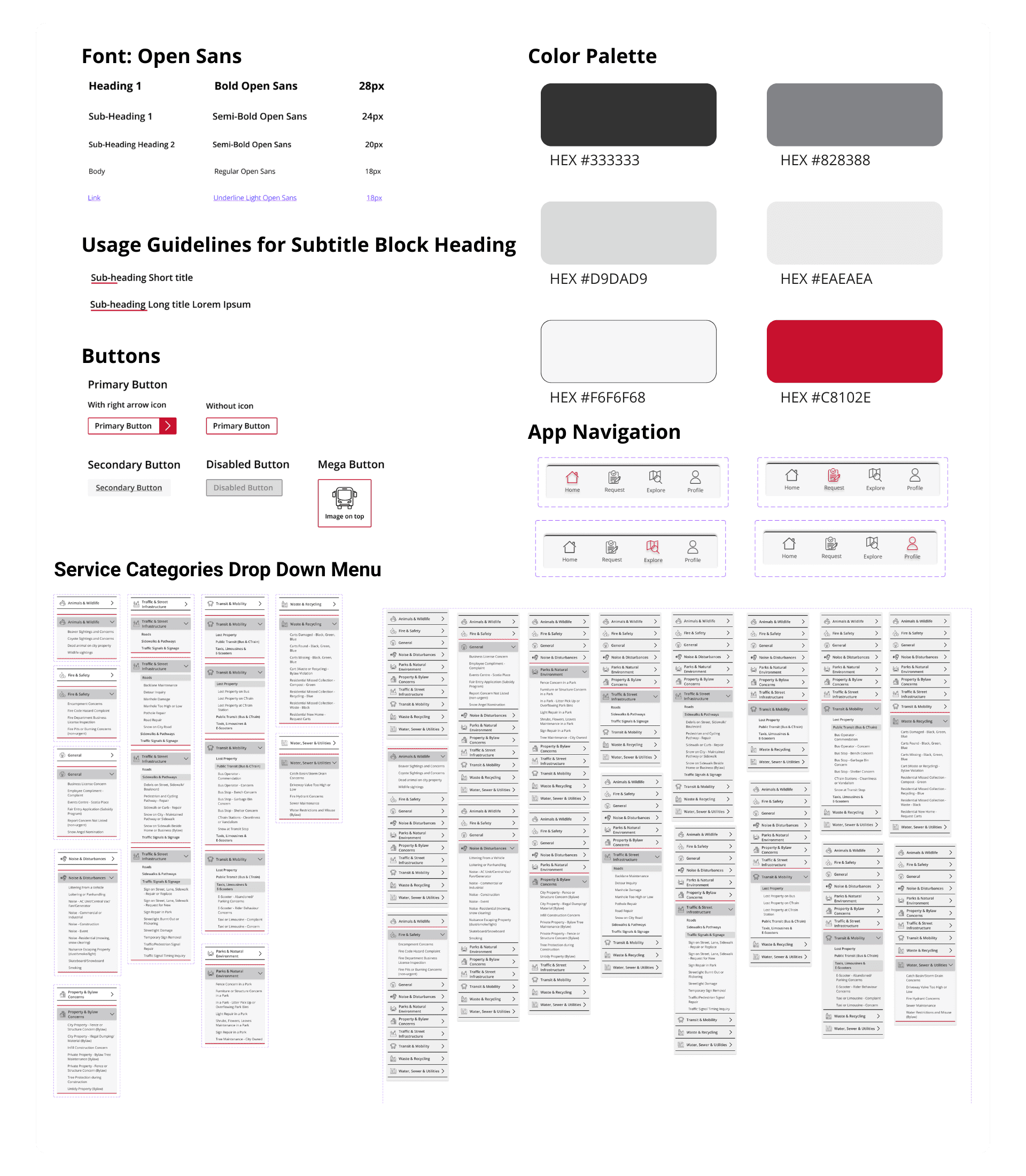
3. UI Elements & Design System
Establishing a Cohesive and Accessible Visual Language
I developed a complete set of UI components to establish consistency across the interface. The system includes typography, color palettes, buttons, and icons, all designed to improve readability and accessibility.
The visual language reflects the city’s professional identity while promoting simplicity, clarity, and trust.
Final Designs


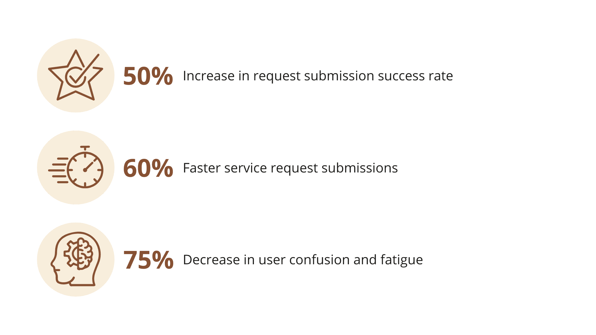
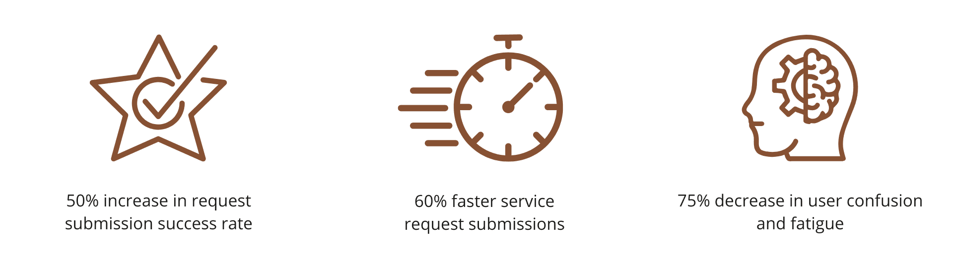
Results
The results show how meaningful design can transform a civic experience. Task success increased by 50%. Category selection time was reduced by 60%, shrinking a seven-minute task to just three minutes or under. And most importantly, testing revealed a 75% reduction in confusion and cognitive fatigue, proving that a clearer structure and stronger guidance can restore trust and confidence in everyday digital services.
Reflection
This project demonstrated the impact of user-centered design in civic technology. By restructuring the navigation, clarifying task flows, and focusing on clarity, speed, and trust, I reduced cognitive load and improved user confidence. This helped transform an overwhelming municipal tool into a more intuitive and accessible public service.
If expanded into full implementation, my next steps would focus on building out live tracking features, real-time updates, and more advanced usability testing with a broader and more diverse group of users. I would also prioritize accessibility audits and deeper collaboration with city stakeholders to align user needs with backend capabilities.
Ultimately, this project underscored how small UX improvements can make a big difference. With the right investment in design, even complex municipal tools can feel approachable, inclusive, and empowering.


